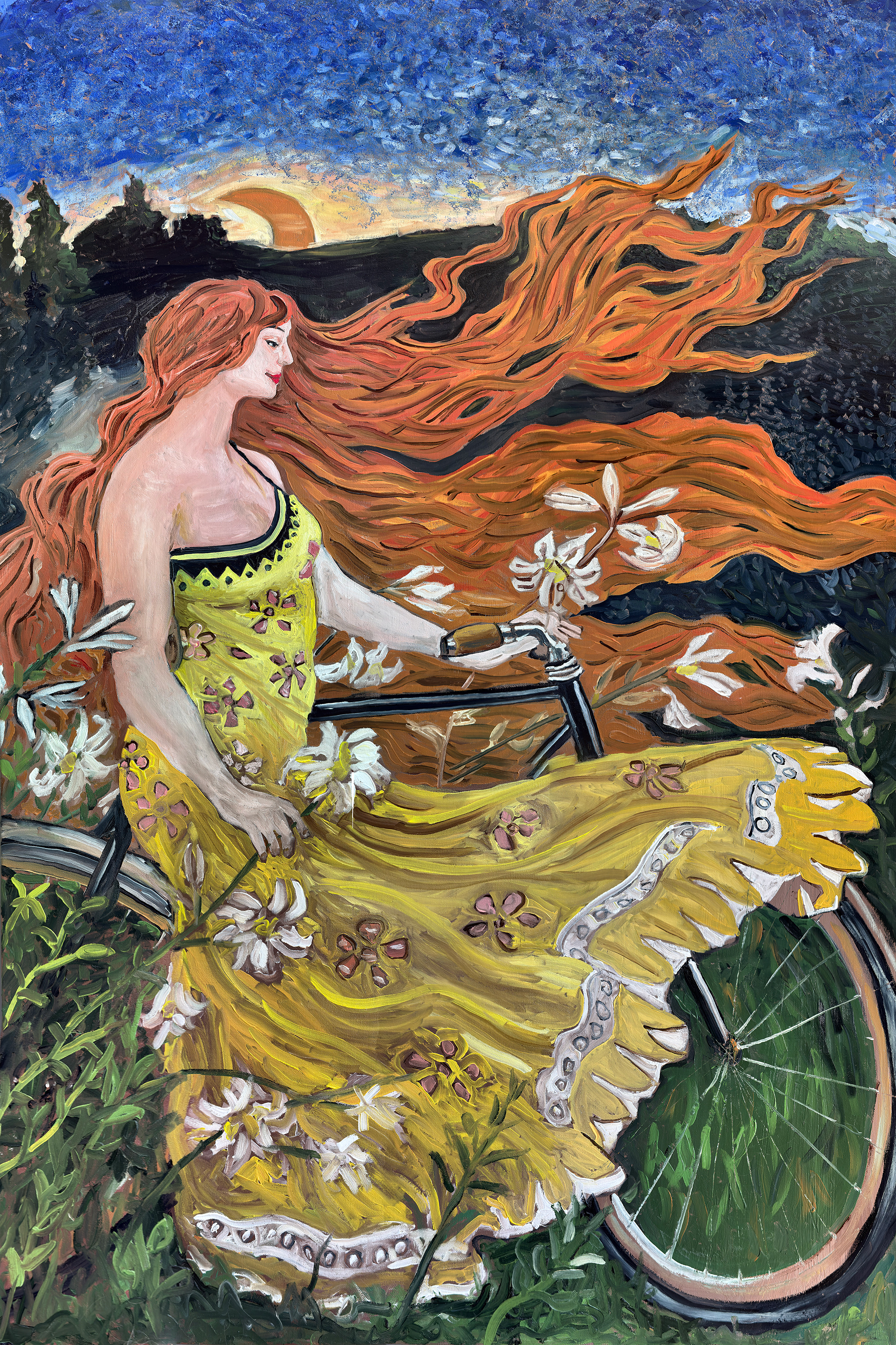
The great cycling posters of the 1890s and 1900s have one thing in common that is easy to overlook: they are all, underneath the commerce, trying to make the same image. A winged figure. A night sky. A bicycle that has somehow left the earth behind. The brand name sits across the top and the dealer's address runs down the side, but those are constraints imposed from outside. The image itself - the one the artist was actually making - is something else entirely.
Luna is that image. Not a copy of any poster that exists, not a recreation of a specific source - but an original painting working in the same visual language, asking the same question those artists were asking, with every word and logo and price list removed. What the genre was always trying to make, made directly.
The Golden Age of Cycling Advertising
The bicycle boom of the 1890s produced one of the most concentrated explosions of visual art in commercial history. Manufacturers across France, Belgium, Britain, and America needed to sell bicycles - and to sell them, they needed to make people feel something about them. They turned to the best illustrators and poster artists of the age, gave them significant creative latitude, and the result was a body of work that has outlasted every one of the companies that commissioned it.
The dominant visual language was Art Nouveau - the style that ran through European applied art from roughly 1890 to 1910, characterised by flowing organic lines, flattened perspective, bold color fields, and a particular tendency to render women as allegorical figures surrounded by natural forms. Bicycles fit into this language remarkably well. They were modern, elegant, lightweight, associated with freedom and movement. They were everything Art Nouveau wanted to celebrate.
The greatest of these poster artists understood that they were not illustrating a product. They were constructing a mythology.
Cycles Gladiator and the Winged Figure
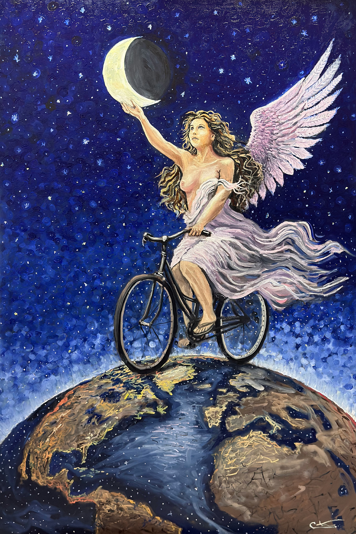
Of all the images produced in the golden age of cycling advertising, one stands closest to Luna. The Cycles Gladiator poster, produced around 1905 and attributed to Maurice Marodon, shows a winged female figure astride a bicycle, ascending through a night sky above the curve of the earth. She wears flowing white drapery. Her wings are large and luminous. She is not riding the bicycle so much as being carried by it - or carrying it - through the stars.
It is one of the most reproduced cycling images in history, and for good reason. Marodon understood something that many of his contemporaries missed: the bicycle, at its most elemental, is a machine that extends human capability beyond what the body alone can do. Put that idea through the filter of classical mythology and you get a figure who is half-human, half-divine - someone for whom the normal rules of earth and gravity have been renegotiated.
The Gladiator poster has a brand name. It has a logo. It has the commercial apparatus that justified its existence. But the image underneath that apparatus is something else entirely - a genuine piece of visual imagination that would have meant something even if it had never sold a single bicycle.
Luna begins where Marodon left off.
Alphonse Mucha and the Art of Transformation
Alphonse Mucha is the name most often associated with the visual world these paintings inhabited. The Czech artist arrived in Paris in 1887 and spent the 1890s producing the poster work that made him famous - theatrical bills, magazine covers, and commercial advertising that transformed the language of illustration into something approaching fine art.
His 1898 poster for Cycles Clement and Cie is a masterclass in what this era could achieve. A woman in the center of the composition, surrounded by an elaborate decorative border of the kind Mucha had made his signature. The bicycle almost secondary - present, implied, but less important than the figure and the world of pattern and color that surrounds her. The product being sold is the feeling, not the machine.
Mucha's contribution to cycling advertising was to elevate it into a category where the question of whether something was art or commerce became genuinely difficult to answer. His posters hung in apartments. They were collected. They were reproduced without permission, which he found irritating, but which testified to their power as images independent of their commercial function.
This is the tradition Luna enters. Not the commerce - the image underneath the commerce.
Jules Cheret and the Celestial Vocabulary
Jules Cheret, often called the father of the modern poster, developed the visual vocabulary that his successors - Mucha, Toulouse-Lautrec, Grasset, and the others - would inherit and transform. His figures were dynamic, joyful, often in motion, surrounded by light and color. He used the female form as a symbol of energy and vitality rather than passivity - a departure from the academic painting tradition of the same period, where women were more commonly depicted as static and decorative.
Cheret also understood the sky. Many of his posters placed their central figures against deep blues and blacks - night skies, theatrical darkness, the saturated color that lithographic printing could achieve and oil paint could only approximate. The stars and moons that appear in cycling posters of this era are partly decorative and partly symbolic: they place the bicycle in a universe larger than the city street or the country road, associating it with something cosmic and permanent rather than merely practical.
The deep blue starfield in Luna is that sky. The crescent moon is that moon. The painter knew what he was reaching for.
What the Words Were Hiding
When you look at a great cycling poster from 1900, the text is usually the weakest part. The brand name in its decorative typeface, the dealer's address in small print at the bottom, the dimensions and price options - all of this is information, and information ages. What does not age is the image: the figure, the bicycle, the sky, the sense of movement and freedom and aspiration that the artist poured into the space between the headlines.
There is an argument that the commercial context that produced these images was also, in some ways, limiting them. The poster had a job to do. It had to include the name. It had to leave room for the address. The compositional space available to the artist was constrained by the requirements of the client.
Remove those constraints, and what do you have? You have the pure image - the allegorical figure, the bicycle, the night sky, the globe, the moon - freed from the obligation to sell anything. Freed to simply mean what it means, which is: the bicycle takes you somewhere you could not reach without it. On a bicycle, you can ride to the edge of the world. You can reach up and hold the moon.
That is what Luna is saying. It says it in oil paint rather than lithographic ink, on canvas rather than paper, a hundred and twenty years after the image it is in conversation with. But the idea is the same. It was always the same.
The Globe, the Moon, the Wings
The compositional elements of Luna reward attention individually. The globe she rides across is the Earth seen from outside - the way astronauts see it, the way it appears in the famous photographs that changed how humanity understood its own position in space. Placing the bicycle on top of this image is an act of deliberate scale-disruption: the machine that was revolutionary for covering thirty miles is here placed at the apex of the planet itself.
The wings are the element that connects most directly to the Cycles Gladiator tradition - the figure as something more than human, the bicycle as the mechanism of transcendence rather than merely transport. Wings in the Western visual tradition carry specific weight: they belong to angels, to Nike the goddess of victory, to Mercury the messenger. They signal that the bearer moves between worlds. Here, she moves between the world and the sky, the earth and the stars, the practical and the mythological.
The crescent moon she holds - or offers, or receives - is the painting's most concentrated symbol. The moon governs tides, marks time, has been a metaphor for the cycles of human experience since before written language. She holds it the way you hold something precious and slightly surprising: carefully, with the arm extended, tilting slightly upward as if still processing the fact that she was able to reach it.
On a bicycle, apparently, you can.
About the Painting
This work is an original oil on canvas, 40 inches wide by 60 inches tall, completed on January 24, 2026. It is part of The Golden Age Series by Christopher Watson - an ongoing body of 50 original oil paintings exploring cycling, motion, and human perseverance. Luna is the series' most direct engagement with the visual tradition of the cycling poster - a conscious homage to the Art Nouveau advertising of 1890 to 1910, rendered in oil paint, with every word and brand name removed. What remains is the image those posters were always trying to make.
Christopher Watson is a self-taught oil painter based in Peterborough, New Hampshire - a software engineer and endurance athlete with twelve Ironman finishes who began painting seriously in 2024. Cycling is his sole subject. The work is made by hand, one canvas at a time.
The original is available for private inquiry. Fine art archival prints are available in multiple sizes through the Velo Paintings print shop. Luna is, among the works in this series, the one that most directly places itself in the lineage of cycling as visual art. If that lineage interests you, the print belongs on your wall.