On the limited palettes of Belle Époque cycling posters, the pigments behind them, and what five colours turn out to be able to do.
It started as a printing problem.
If you wanted to produce a large-format colour poster in 1890s Paris, you were working with chromolithography - a process in which each colour required its own separate limestone slab, its own craftsman, and its own pass through the press. The stones used for the biggest posters weighed hundreds of pounds. Precise alignment had to be maintained across every single colour pass. A high-end reproduction print of the era might use nineteen stones for thirty-eight progressive colour proofs. That kind of production was for wealthy collectors. The commercial advertising poster - the kind that papered the walls of Paris at the scale that made the Belle Époque the age of the poster - used three colours, perhaps four or five, and not a stone more than absolutely necessary.
This was not an aesthetic choice. It was an economic one. And it produced one of the most recognisable visual languages in the history of printed art.
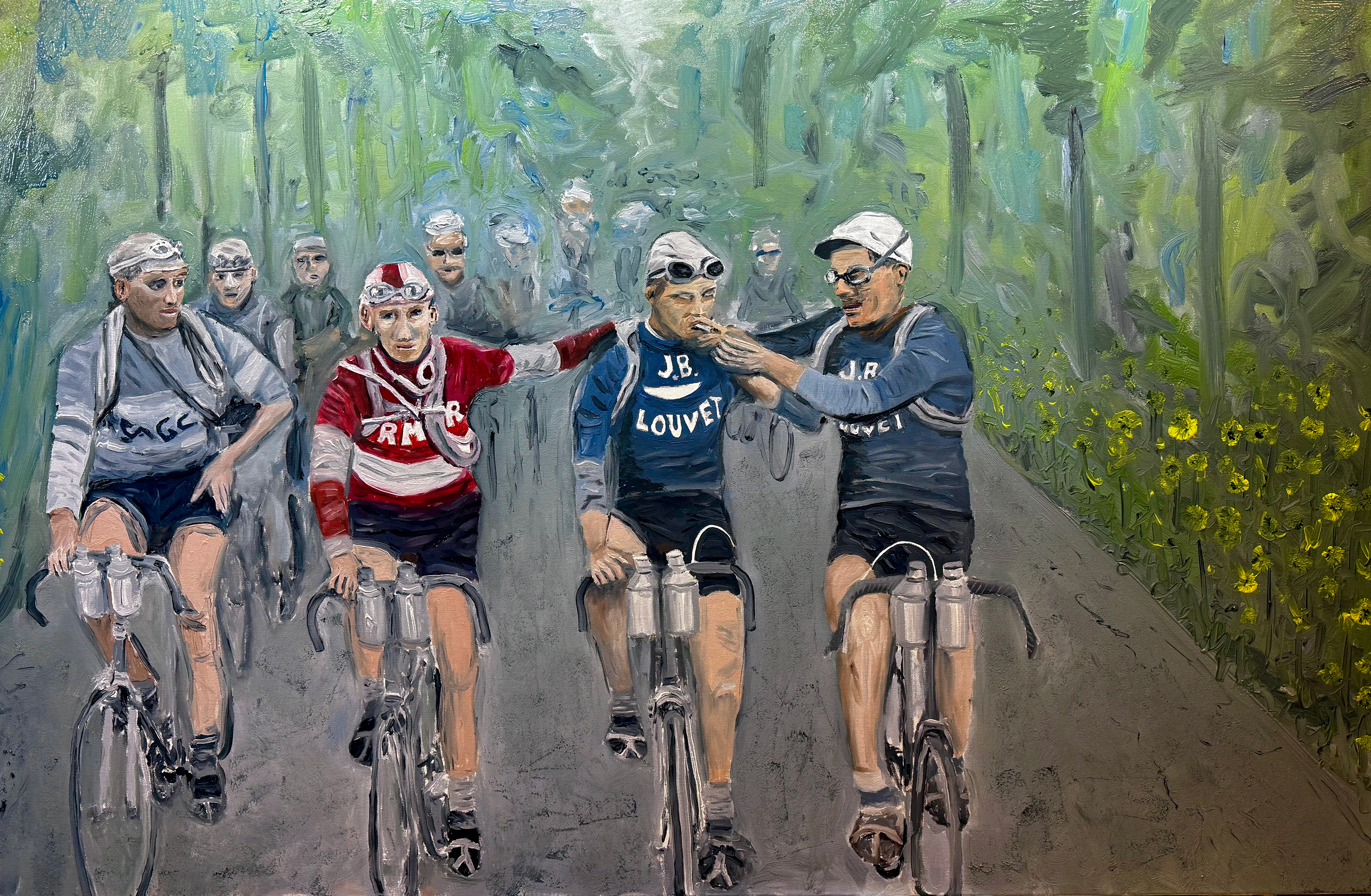
I have been thinking about this constantly while working through this painting series, because the constraint the lithographers were forced into is the same one I have chosen deliberately. The series is painted from a palette of five pigments. Five is, it turns out, a number with a lot of history behind it.
The Lithographic Problem
Chromolithography was formalised in France in 1837, when Godefroy Engelmann of Mulhouse received the first patent for the colour process. The technique depended on the chemistry of grease and water: a design drawn in greasy crayon or ink onto flat limestone, treated with acid and gum arabic to fix the image, would accept oil-based ink only where the drawing was. Every pass through the press transferred one colour. Every colour required its own stone and its own registration.
Jules Chéret - the man who essentially invented the modern advertising poster, producing over a thousand designs in his lifetime - solved the economic problem with a technical innovation around 1880. He developed a three-stone process: one stone each for red, yellow, and blue, printed with semi-transparent inks. Where the red and yellow overlapped, you got orange. Where yellow and blue crossed, you got green. Where all three sat on top of each other, you got a rich dark. From three colours and their overlapping combinations, Chéret built an entire chromatic vocabulary - luminous, joyful, unmistakable.
The result was an aesthetic defined entirely by its constraints: flat areas of bold colour, strong contour, and a particular kind of light that comes from semi-transparent inks layered over white paper. These are not paintings with tonal gradation and atmospheric depth. They are declarations. The limitation made them readable at distance, at speed, on the side of a building in the rain. It also made them beautiful in a way that a more elaborate palette might not have.
The Posters
| 3Colours in Lautrec’s final poster | 1828Synthetic ultramarine invented | 1868Alizarin first synthesised | 5Pigments in this series |
Jules Chéret (1836–1932) - The Founder
Chéret learned lithographic printing in London between 1859 and 1866, returned to Paris, and opened his own print house that year. He is credited with the first chromolithographic poster suitable for mass public display. His characteristic palette ran warm: jubilant reds, oranges, luminous yellows, ultramarine blues - the impression of abundance and movement created from three primary stones. More than a thousand poster designs in a lifetime. He was made a Chevalier of the Légion d’honneur in 1890.
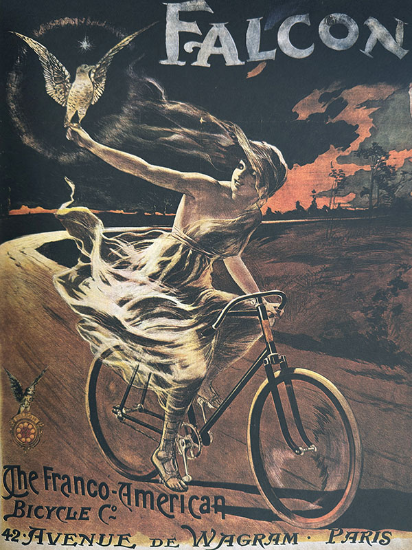
Henri de Toulouse-Lautrec - La Chaîne Simpson, 1896
Lautrec’s last major poster - and his only dedicated cycling work - was commissioned by Louis Bouglé, the French representative of the Simpson Lever Chain company, after Bouglé took Lautrec to London for three days to meet the Simpson racing team. The poster depicts champion French cyclist Constant Huret in full flight at a Paris velodrome. It was produced using three basic colours: yellow, red, and blue. Lautrec was famously indifferent to literal colour accuracy - in the poster, dark hair is rendered in pale yellow because that was the only available alternative within his three-colour scheme. The choice reads as stylistic. It was practical.
Alphonse Mucha - Cycles Perfecta, 1902
Mucha’s cycling poster is the warmest of the four. Printed by F. Champenois in Paris - the printer with whom Mucha had signed an exclusive contract in 1896 - it features a woman in a pink and white dress with long golden hair leaning over bicycle handlebars. Mucha used more stone separations than Chéret or Lautrec, which gave him greater tonal subtlety. His characteristic palette drew on warm ochre-golds, dusty rose, sage and olive green, and creamy off-whites: colours that feel derived from nature and late afternoon light. Richer than Chéret’s primary energy, softer than Lautrec’s bold economy.
Leonetto Cappiello (1875–1942) - Cycles Sirius, 1907
Cappiello broke from everything that came before him. Where Chéret had used white paper as ground, Cappiello placed his isolated figures against solid black, so that a single red or yellow cyclist appeared to burn out of the darkness. His 1907 Cycles Sirius poster is the best example of the approach applied to cycling advertising. The high contrast intensified apparent saturation: one vivid colour against black read as more saturated than the same colour printed against a pale background. He is sometimes called the father of modern advertising. He was working with an even more radically limited palette than his predecessors - often a single intense hue against darkness.
What They Were Working With
These posters were printed, not painted, but the pigments available to painters of the same era are worth understanding because they define what the palette of the turn of the century actually looked like in physical terms - what was achievable, what was dangerous, and what simply did not yet exist.
| Pigment | Status c. 1900 | Notes |
|---|---|---|
| Lead White | Standard — toxic | Basic lead carbonate. The dominant white for centuries. Excellent opacity and drying. Painters and factory workers suffered chronic lead poisoning. |
| Chrome Yellow | Standard — toxic, unstable | Lead chromate. Introduced c. 1804. Brilliant yellow, used by Renoir, Pissarro, and others. Prone to darkening over time. Van Gogh’s faded yellows. |
| Vermilion | Standard — toxic | Mercuric sulphide. Ancient pigment, brilliant red-orange. Used until cadmium reds became affordable. Mercury compound. |
| Prussian Blue | Standard — stable | Created 1704 - the first synthetically produced colour pigment. Intensely deep blue. |
| French Ultramarine | Standard since 1828 | Jean-Baptiste Guimet’s synthesis, awarded February 4, 1828. Replaced lapis lazuli ultramarine that had cost more per weight than gold. |
| Alizarin Crimson | Standard since 1868 | Synthesised by Graebe and Liebermann. First natural dye to be reproduced synthetically. Lightfastness later found to be poor. |
| Burnt Umber | Standard — ancient | Iron oxide and manganese. In continuous use from cave painting through the present day. Completely stable, non-toxic. |
| Titanium White | Not yet available | Industrial production began 1916. First artist-grade product: 1921. The painter working in 1900 did not have it. |
| Bismuth Yellow | Not yet available | First produced as a pigment in the 1920s. First patented in Germany in 1982. Commercially significant from c. 1990. |
The toxicity column is not incidental. Chrome Yellow contains lead. Vermilion contains mercury. Lead White - the standard white in every painter’s studio for centuries - was acutely poisonous, and its production killed factory workers and slowly degraded the health of the painters who used it daily. The palette of 1900 was, in significant part, a palette of beautiful and dangerous materials that nobody had yet found a safe replacement for.
Five Pigments
The five pigments I am working with are Titanium White, Bismuth Yellow, Permanent Alizarin Crimson, Burnt Umber, and French Ultramarine. Each of them has a history worth knowing.
French Ultramarine is the oldest story here. Natural ultramarine - made from ground lapis lazuli purified from its grey stone matrix - was described as “the most expensive pigment” for centuries, worth more per weight than gold at the height of the Renaissance. It was typically reserved for the cloaks of Christ and the Virgin Mary: the highest colour honour in a painter’s power to bestow. In 1824, the Société d’Encouragement pour l’Industrie Nationale offered 6,000 francs for anyone who could produce a synthetic version costing no more than 300 francs per kilogram. Jean-Baptiste Guimet developed his process in 1826 and was awarded the prize on February 4, 1828. By the Belle Époque, the pigment that had defined religious painting for half a millennium was a cheap, commercially available blue that any working lithographer could print from. This is the same chemical compound I am squeezing from a tube today.
Permanent Alizarin Crimson requires a distinction. Alizarin - the active dyestuff in the madder root that had been used as a red pigment for centuries - was first synthesised in 1868 by German chemists Carl Graebe and Carl Liebermann. It was the first natural dye to be reproduced synthetically, and it rapidly replaced the madder lake that had preceded it. The painters of 1900 were using that synthetic alizarin (Pigment Red 83). However, it has poor lightfastness: it fades under prolonged UV exposure, particularly in thin washes. The “Permanent” version sold today is not alizarin at all - manufacturers like Gamblin and Winsor & Newton substitute quinacridone or anthraquinone reds, blended to match the hue and transparency of the original. Quinacridone was only developed in the 1950s. “Permanent Alizarin Crimson” is therefore a modern pigment formulated to behave like a historically important colour. The hue is the same. The chemistry is completely different, and far more stable.
Burnt Umber is the opposite of all that complexity. It is iron oxide, manganese oxide, and aluminium oxide, occurring naturally in clay deposits, calcined (heat-treated) to deepen and warm the colour. It has been in continuous use from cave painting to the present day. There is nothing to say about its history that would surprise you, because it has no real history - it is simply always there. Old Master painters used it for shadows. I use it for shadows. Nothing about it has changed.
Titanium White is the newcomer - or rather, the replacement. The painters of 1900 were using Lead White, which is acutely toxic and has been used in fine art since antiquity. Titanium dioxide was characterised as a mineral in 1795, industrial production for commercial purposes began simultaneously in Niagara Falls and Norway in 1916, and the first artist-grade Titanium White appeared in 1921. It has the highest refractive index of any known white pigment, is completely non-toxic, does not yellow, and does not darken. It replaced Lead White on the grounds of safety, and it is demonstrably better in most respects. Traces of titanium dioxide have been found on Camille Pissarro’s outdoor easel from the 1890s - apparently ceramic-grade TiO2 was migrating from industrial use into some painters’ practice before full commercialisation - but 1921 is the date when the painter working in oil could reliably reach for it.
Bismuth Yellow is the most recently arrived pigment on this palette, and it is there specifically because everything that came before it was either toxic, unstable, or both. Chrome Yellow - the dominant yellow of the Belle Époque - is a lead chromate: brilliant, historically important, and prone to darkening over time into greenish-brown as the lead chromate converts to lead sulfide on exposure to sulphur in the air. Van Gogh’s faded yellows are partly this process at work. Cadmium Yellow is more stable but cadmium is a toxic heavy metal, now restricted in the EU for industrial use. Bismuth Vanadate (Pigment Yellow 184) was first produced as a pigment in the 1920s, first patented in Germany in 1982, and became commercially significant from around 1990. It is non-toxic, offers exceptional lightfastness, and has a brilliant, clean hue that makes it the closest safe modern substitute for Chrome Yellow in character. It is the youngest pigment on this palette by several decades, and its purpose is to do cleanly and safely what Chrome Yellow did beautifully and dangerously.
What Five Pigments Can Do
The particular combination of French Ultramarine, Bismuth Yellow, Permanent Alizarin Crimson, Burnt Umber, and Titanium White is structured around a warm-cool axis. Ultramarine is a warm, slightly reddish blue. Alizarin is a cool, slightly bluish red. Together they mix to clean, deep violets and mauves - a direction that a different blue and red combination would resist. Bismuth Yellow added to either produces a wide range of greens toward the cool side or earthy warm neutrals toward the brown side. Burnt Umber with Ultramarine produces a rich near-black - the classic chromatic dark mix that has been in use since the Old Master period - with the ratio controlling whether the dark leans warm or cool.
What the palette resists is a screaming hot red-orange. The bluish bias of Alizarin Crimson pulls any orange mix toward ochre and terracotta rather than cadmium fire. This is not a palette built for visual aggression. It is a palette for nuance and coherence - for the slightly muted, harmonious colour relationships that happen when every mixture shares pigment ancestry with every other mixture.
This is precisely what the lithographic posters achieved through constraint. Chéret’s entire colour world derived from three stones, so every colour in his posters was related to every other colour by genealogy. The unity was structural, not decorative. The limitation created the harmony.
The Zorn Palette - named for the Swedish portrait painter Anders Zorn, who used Ivory Black, Lead White, Yellow Ochre, and Vermilion - demonstrates the same principle with four pigments and no blue at all. Zorn produced the appearance of cool blue tones through simultaneous contrast: grey mixed from black and white reads as blue when placed against warm flesh tones. The constraint did not limit what he could paint. It unified everything he painted.
The Greek painter Apelles - considered the greatest painter of antiquity, whose work survives only in description - is recorded by Pliny the Elder as having used four colours throughout his career: a white, a yellow, a red, and a black. This is not a story about the poverty of ancient materials. It is a story about what discipline does to a painter’s eye.
Toward the Source
The next direction from here is grinding my own paints.
I have not made that transition yet. I am still working with tube colours. But the further I move into this project, the more I find myself thinking about what is actually inside the tube - the specific pigment, its origin, its behaviour in oil, its relationship to what the painters of 1900 were using before the safe modern alternatives existed. Learning to grind pigment in oil is not a nostalgia exercise. It is a way of understanding the material at a level that tube paint does not require you to understand it.
The pigments themselves - bismuth vanadate powder, synthetic ultramarine, titanium dioxide, the umber earth - are not fundamentally different from what a painter would have ground a century ago, with the exception of the toxicity improvements. The process of mulling pigment into linseed or walnut oil, controlling the oil ratio, adjusting the body and handling of the paint - that is the same process. The only difference is that the historical painter had no alternative.
The chromolithographers of the 1890s used what they had. Three colours. Three stones. The press, the registration marks, the wet ink drying before the next pass. What they made from those materials became the visual language of an era. I keep thinking about that when I am standing at the easel working with the same five pigments for the fifth or sixth painting in a row - not as a limitation I am tolerating, but as a set of relationships I am beginning to know.
Jules Chéret’s three-stone lithographic process was developed c. 1880. Henri de Toulouse-Lautrec’s La Chaîne Simpson was produced in 1896 and depicts cyclist Constant Huret. Alphonse Mucha’s Cycles Perfecta (1902) was printed by F. Champenois, Paris. Leonetto Cappiello’s Cycles Sirius was produced in 1907. Synthetic ultramarine was first produced by Jean-Baptiste Guimet, awarded February 4, 1828. Alizarin was first synthesised by Carl Graebe and Carl Liebermann in 1868. Titanium White first became available as an artist’s pigment in 1921. Bismuth Vanadate Yellow (PY 184) was first patented in Germany in 1982.